ShopDreamUp AI ArtDreamUp
Deviation Actions


Description
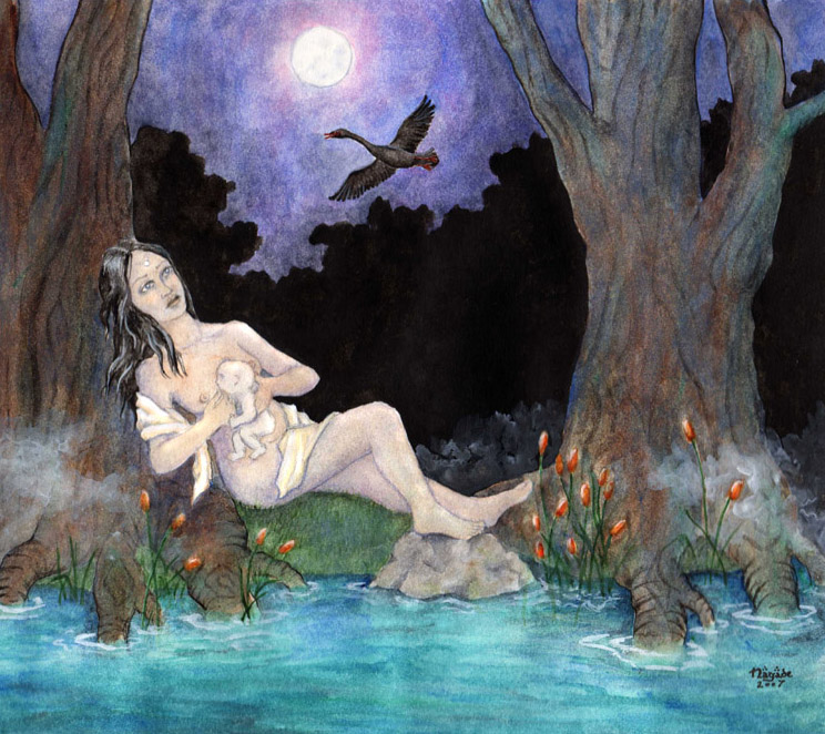
"And Aredhel bore to Eöl a son in the shadows of Nan Elmoth, and in her heart she gave him a name in the forbidden tongue of the Noldor, Lómion, that signifies Child of the Twilight..."
"A black swan is born in the night, the misty pond has got a new king..."
A sketch of an early concept for this painting can be found here in my sketch gallery.
The Silmarillion. J.R.R. Tolkien
"A black swan is born in the night, the misty pond has got a new king..."
Nightfall in Middle Earth. Blind Guardian
A sketch of an early concept for this painting can be found here in my sketch gallery.
Image size
744x662px 191.27 KB
© 2007 - 2024 meteoro-nayade
Comments2
Join the community to add your comment. Already a deviant? Log In
hey, i'm from  ! i just wrote like 3 paragraphs about this piece... and thenmy computer acted up and closed the window XDDD
in short: great use of color- the blue hues are a wonderful choice that add a lot of mystery and coolness to the image it was a good decision to add blue to every other color, it works to unify the piece
the perspective of the girl is off, however. her legs and feet seem to be in profile/side view form, while her body seems to twist oddly into an angle as if we're looking down on her. her back should be arched against the tree and ground, not straight. the straightness gives her position an unnatural look.
more cloth would add more mystery and flowyness. it can also be used to represent another watery sort of form. the water ripples look stunning, btw, that whole area of water and light is very delicate and intricate
the black shape of middleground flattens out the whole picture. i understand that it helps to bring more focus to the foreground, but it gets the eye caught between foreground and middleground, just stops the flow completely. maybe indicate at least a little of the middleground, to place breaks and add interest to the middleground? adding any sort of big, black shape into a picture will flatten it... it's usually a good idea to avoid doing so.
so, good concept, great use of color, just make sure all of your perspective/angles are consistant and stay away from big, black shapes! nice work (Smile)")
! i just wrote like 3 paragraphs about this piece... and thenmy computer acted up and closed the window XDDDin short: great use of color- the blue hues are a wonderful choice that add a lot of mystery and coolness to the image
the perspective of the girl is off, however. her legs and feet seem to be in profile/side view form, while her body seems to twist oddly into an angle as if we're looking down on her. her back should be arched against the tree and ground, not straight. the straightness gives her position an unnatural look.
more cloth would add more mystery and flowyness. it can also be used to represent another watery sort of form. the water ripples look stunning, btw, that whole area of water and light is very delicate and intricate
the black shape of middleground flattens out the whole picture. i understand that it helps to bring more focus to the foreground, but it gets the eye caught between foreground and middleground, just stops the flow completely. maybe indicate at least a little of the middleground, to place breaks and add interest to the middleground? adding any sort of big, black shape into a picture will flatten it... it's usually a good idea to avoid doing so.
so, good concept, great use of color, just make sure all of your perspective/angles are consistant and stay away from big, black shapes! nice work